|
R: basic graphs 2 (with ggplot2)
|
Back to Local tips for R
http://www.psychol.cam.ac.uk/statistics/R/graphs2.html
|
Here we’ll move to the ggplot2 library, and replicate our previous basic graphs.
The ggplot2 library:
library(ggplot2)
If that doesn’t work, use install.packages("ggplot2") to install it, then retry.
It’s hard to get ggplot to draw left and bottom axes only. Some use a post-processing hack (see http://wilke.openwetware.org/Creating_figures.html). I tried switching off all borders, using opts(panel.border = theme_blank()) and then using geom_hline(y=0) and geom_hline(y=0) to draw axes, which is OK, but it’s hard to get them positioned correctly. However, ggplot2 is open-source. So we can explore it: sudo apt-get install git to get the appropriate source code tools, then git clone https://github.com/hadley/ggplot2.git to fetch the source. And looking in theme-elements.r we can see the sort of thing to aim for. So we can create some code snippets which we can include in one line from rnc_ggplot2_border_themes_2011_03_17.r or rnc_ggplot2_border_themes_2013_01.r, like so:
# For versions of ggplot2 around 0.8.7 / prior to Jan 2013:
source("http://egret.psychol.cam.ac.uk/statistics/R/extensions/rnc_ggplot2_border_themes_2011_03_17.r")

# For ggplot2 version 0.9.3 / from Jan 2013 onwards:
source("http://egret.psychol.cam.ac.uk/statistics/R/extensions/rnc_ggplot2_border_themes_2013_01.r")
This provides a number of possibilities but the theme_border() version is probably the easier to use. Its use is illustrated below: see opts( panel.border = theme_border(...) ).
These files are all comma-separated value (CSV) text files:
Let’s load them all in, to begin with:
phdfig37b = read.table("PhD_fig37B.csv", header=TRUE, sep=",", na.strings="NA", dec=".", strip.white=TRUE)
phdfig21a = read.table("PhD_fig21A.csv", header=TRUE, sep=",", na.strings="NA", dec=".", strip.white=TRUE)
phdfig22d = read.table("PhD_fig22D.csv", header=TRUE, sep=",", na.strings="NA", dec=".", strip.white=TRUE)
phdfig23 = read.table("PhD_fig23.csv", header=TRUE, sep=",", na.strings="NA", dec=".", strip.white=TRUE)
phdfig28c = read.table("PhD_fig28C.csv", header=TRUE, sep=",", na.strings="NA", dec=".", strip.white=TRUE)
mdfig30a = read.table("MD_fig30A.csv", header=TRUE, sep=",", na.strings="NA", dec=".", strip.white=TRUE)
mdfig30b = read.table("MD_fig30B.csv", header=TRUE, sep=",", na.strings="NA", dec=".", strip.white=TRUE)
Now, it’s much easier to work with ggplot2 if you have a single X variable, a single Y variable (perhaps with another for error bars), and grouping variables (factors). So we’ll reorganize our data:
# Currently, our columns are: session, sham, ACCX, SEM_sham, SEM_accx.
# So first we rearrange (using "rbind" to bind rows together):

phdfig37b_long = with(phdfig37b,
    rbind( data.frame( lesion = "sham", session = session, diffscore = sham, sem = SEM_sham ),
           data.frame( lesion = "ACCX", session = session, diffscore = ACCX, sem = SEM_accx ) )
)
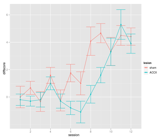
So first, a quick version:
qplot(session, diffscore, colour=lesion, data=phdfig37b_long) + geom_line() + geom_errorbar(aes(ymin = diffscore - sem, ymax = diffscore + sem))

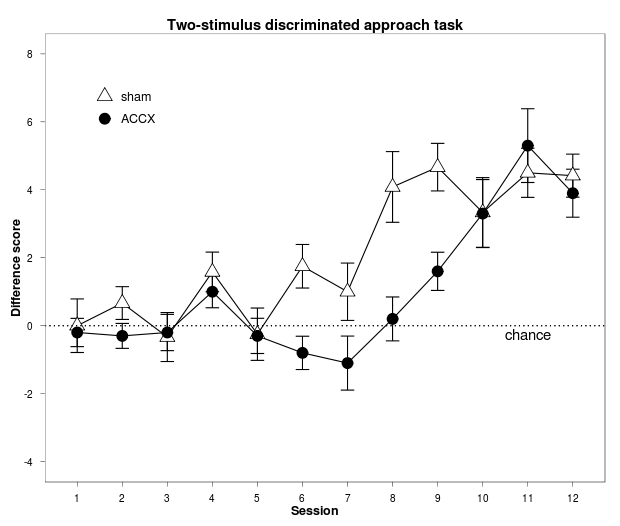
Now the proper thing:
f1 = ggplot(data = phdfig37b_long, aes(x = session, y = diffscore, group = lesion) ) + # lesion becomes a classifying factor
     geom_errorbar(aes(ymin = diffscore - sem, ymax = diffscore + sem), width=0.3) + # add error bars (do so before geom_point so the points are on top of the error bars)
     geom_line() + # join points with lines (specify this before geom_point, or the lines will be drawn over the shapes)
     geom_point(aes(shape=lesion, fill=lesion), size=5) + # add a scatterplot; constant size, shape/fill depends on lesion
     scale_x_continuous("Session", breaks=1:12) + # have tick marks for each session
     scale_y_continuous("Difference score", limits = c(-4, 8), breaks=seq(-4, 8, by = 2)) + # rescale Y axis slightly
     scale_shape_manual(values=c(24,21)) + # explicitly have sham=fillable triangle, ACCX=fillable circle
     scale_fill_manual(values=c("white","black")) + # explicitly have sham=white, ACCX=black
     stat_abline(intercept=0, slope=0, linetype="dotted") + # add a reference line
     annotate("text", x=11, y=-0.25, label="chance") + # and a manual label or annotation
     theme_bw() + # make the theme black-and-white rather than grey (do this before font changes, or it overrides them)
     opts(title = "Two-stimulus discriminated approach task",
          plot.title = theme_text(face="bold", size=14), # use theme_get() to see available options
          axis.title.x = theme_text(face="bold", size=12),
          axis.title.y = theme_text(face="bold", size=12, angle=90),
          panel.grid.major = theme_blank(), # switch off major gridlines
          panel.grid.minor = theme_blank(), # switch off minor gridlines
          legend.position = c(0.2,0.8), # manually position the legend (numbers being from 0,0 at bottom left of whole plot to 1,1 at top right)
          legend.title = theme_blank(), # switch off the legend title
          legend.text = theme_text(size=12),
          legend.key.size = unit(1.5, "lines"),
          legend.key = theme_blank() # switch off the rectangle around symbols in the legend
     )
print(f1)
Regarding the "shape" and "linetype" options:
# To illustrate all the shapes:
testvec = 0:70
qplot(x=testvec, y=testvec, shape=testvec, size=5)
# The shapes are the standard R shapes: see http://wiki.stdout.org/rcookbook/Graphs/Shapes%20and%20line%20types
# shape = ... HOLLOW: 0 square, 1 circle, 2 triangle; 3 plus; 4 X; 5 diamond; 6 inverted triangle;
#                     7 = square with cross inside; 8 = asterisk; 9 = diamond with plus inside; 10 = circle with plus inside;
#                     11 = Star of David (approximately); 12 = square with plus inside; 13 = circle with cross;
#                     14 = square with inverted triangle;
#             SOLID:  15 = square; 16 = circle; 17 = triangle; 18 = diamond; 19 = large circle; 20 = small circle;
#             FILLED: 21 = open circle; 22 = square; 23 = diamond; 24 = triangle; 25 = inverted triangle;
#             then a gap and we start the ASCII sequence: 32 (space!), 33 !, 34 ", 35 #, 36 $, 37 %, 38 &, 39 #, 40 (, 41 ), ... and on through the ASCII characters with 0 = 48, A = 65, etc.
# linetype = 0 "blank", 1 "solid", 2 "dashed", 3 "dotted", 4 "dotdash", 5 "longdash", 6 "twodash"
Regarding colour choice: see also http://colorbrewer2.org/.
It’s easy to save to any common file format you like:
ggsave(filename="fig37b.pdf", plot=f1) # full syntax
ggsave("fig37b.pdf") # quick syntax
ggsave("fig37b.png", dpi=75) # saves the most recent plot in PNG format, at 75dpi
Here’s the PDF output.
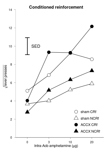
Data preprocessing (we’ll show phdfig21, then the code to transform it, then phdfig21a_long):
  dose   shamCR  shamNCR    ACCXCR  ACCXNCR SEMshamCR SEMshamNCR SEMACCXCR SEMACCXNCR halfSED
1    0 5.112528 3.685772  4.039873 2.771984 0.5539816  0.4961057  1.239309  0.3107314  0.9396
2    3 6.829842 4.024871  9.333684 5.176668 1.0673567  0.6831637  1.855569  0.8208264      NA
3   10 9.230089 5.234141  9.283057 6.334094 0.9947341  0.5378727  2.136579  1.0210376      NA
4   20 8.563017 5.894520 12.162626 7.311355 0.8215663  0.8663228  1.521219  0.9876660      NA
phdfig21a_long = with(phdfig21a,
    rbind( data.frame( lesion = "sham", lever = "CRf", dose = dose, sqrtpresses = shamCR, sem = SEMshamCR, halfSED = halfSED[1] ),
           data.frame( lesion = "sham", lever = "NCRf", dose = dose, sqrtpresses = shamNCR, sem = SEMshamNCR, halfSED = halfSED[1] ),
           data.frame( lesion = "ACCX", lever = "CRf", dose = dose, sqrtpresses = ACCXCR, sem = SEMACCXCR, halfSED = halfSED[1] ),
           data.frame( lesion = "ACCX", lever = "NCRf", dose = dose, sqrtpresses = ACCXNCR, sem = SEMACCXNCR, halfSED = halfSED[1] ) )
)
phdfig21a_long = within(phdfig21a_long, {
    # Now concatenate two columns to make another...
    lesion_lever <- do.call(paste, c(phdfig21a_long[c("lesion", "lever")], sep = " "))
    # ... and make it into a factor, with the factor levels in the order that they appear in the table (not the default, which is to sort them alphabetically)
    lesion_lever <- factor(lesion_lever, levels=unique(lesion_lever))
    # Now make dose a factor (makes ggplot treat it as discrete, not continuous)
    dose <- factor(dose)
})
   lesion lever dose sqrtpresses       sem halfSED lesion_lever
1    sham   CRf    0    5.112528 0.5539816  0.9396     sham CRf
2    sham   CRf    3    6.829842 1.0673567  0.9396     sham CRf
3    sham   CRf   10    9.230089 0.9947341  0.9396     sham CRf
4    sham   CRf   20    8.563017 0.8215663  0.9396     sham CRf
5    sham  NCRf    0    3.685772 0.4961057  0.9396    sham NCRf
6    sham  NCRf    3    4.024871 0.6831637  0.9396    sham NCRf
7    sham  NCRf   10    5.234141 0.5378727  0.9396    sham NCRf
8    sham  NCRf   20    5.894520 0.8663228  0.9396    sham NCRf
9    ACCX   CRf    0    4.039873 1.2393086  0.9396     ACCX CRf
10   ACCX   CRf    3    9.333684 1.8555687  0.9396     ACCX CRf
11   ACCX   CRf   10    9.283057 2.1365794  0.9396     ACCX CRf
12   ACCX   CRf   20   12.162626 1.5212189  0.9396     ACCX CRf
13   ACCX  NCRf    0    2.771984 0.3107314  0.9396    ACCX NCRf
14   ACCX  NCRf    3    5.176668 0.8208264  0.9396    ACCX NCRf
15   ACCX  NCRf   10    6.334094 1.0210376  0.9396    ACCX NCRf
16   ACCX  NCRf   20    7.311355 0.9876660  0.9396    ACCX NCRf
Graph:
f2 = ggplot(data = phdfig21a_long, aes(x = dose, y = sqrtpresses, group = lesion_lever ) ) +
     geom_line() +
     geom_point(aes(shape=lesion_lever, fill=lesion_lever), size=5) + # easier than working with lesion/lever separately
     geom_errorbar(aes(x=1, ymin=10 - phdfig21a$halfSED[1], ymax=10 + phdfig21a$halfSED[1], width = 0.2)) + # free-floating error bars are easy!
     scale_shape_manual(values=c(21,24,21,24)) + # order is shamCR, shamNCR, ACCXCR, ACCXNCR: so circle, triangle, circle, triangle
     scale_fill_manual(values=c("white","white","black","black")) +
     xlab(substitute(paste("Intra-Acb amphetamine (",mu,"g)"))) +
     scale_y_continuous(expression(sqrt("lever presses")), expand=c(0,0), limits = c(0, 14), breaks=seq(0, 14, by = 2)) + # the "expand" bit prevents ggplot2 from expanding the axis a little beyond what you specify
     annotate("text", x=1.4, y=10, label="SED") +
     theme_bw() +
     opts(title = "Conditioned reinforcement",
          plot.title = theme_text(face="bold", size=14),
          axis.title.x = theme_text(face="bold", size=12),
          axis.title.y = theme_text(face="bold", size=12, angle=90),
          panel.grid.major = theme_blank(),
          panel.grid.minor = theme_blank(),
          panel.border = theme_border(c("left","bottom")), # RNC hack, see above
          legend.position = c(0.8,0.2),
          legend.title = theme_blank(),
          legend.text = theme_text(size=12),
          legend.key.size = unit(1.5, "lines"),
          legend.key = theme_blank()
     )
print(f2)
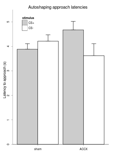
Not a very elegant graph style. Anyway... Data like this, please:
phdfig22d_long = with(phdfig22d,
    rbind( data.frame( lesion=group, stimulus="CS+", latency=CSpluslatency, sem=CSplusSEM ),
           data.frame( lesion=group, stimulus="CS-", latency=CSminuslatency, sem=CSminusSEM ) )
)
phdfig22d_long$lesion = factor(phdfig22d_long$lesion, levels=unique(phdfig22d_long$lesion))
Then graph:
f3 = ggplot(data = phdfig22d_long, aes(x=lesion, y=latency, fill=stimulus) ) +
     geom_errorbar(aes(ymin=latency, ymax=latency+sem, width = 0.2), position=position_dodge(width=0.90)) + # see http://had.co.nz/ggplot2/position_dodge.html
     geom_bar(stat="identity", position="dodge") + # WORKAROUND: once with no colour, for the legend...
     geom_bar(stat="identity", position="dodge", colour="black", legend=FALSE) + # once with a coloured (black!) border, but no legend, or it puts a diagonal line through the legend squares
     # see http://groups.google.com/group/ggplot2/browse_thread/thread/bc99c5f7f1c1ab1e/c0b55fa63d42e4e1
     scale_fill_manual(values=c("grey80", "white")) + # grey80 is closer to white than black
     xlab("") +
     scale_y_continuous("Latency to approach (s)", expand=c(0,0), limits = c(0, 5.5), ) +
     theme_bw() +
     opts(title = "Autoshaping approach latencies",
          panel.grid.major = theme_blank(),
          panel.grid.minor = theme_blank(),
          panel.border = theme_border(c("left","bottom")), # RNC homebrew to get left/bottom border only
          axis.text.y=theme_text(angle=90, hjust=0.5), # rotate the Y axis text anticlockwise 90 degrees, and centre it (0 left, 0.5 centre, 1 right)
          legend.position = c(0.25,0.85),
          legend.key = theme_rect() # provides a border to the coloured squares in the legend
     )
print(f3)
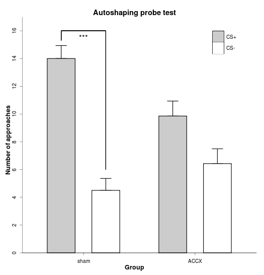
Data manipulation and graph:
phdfig23_long = with(phdfig23,
    rbind( data.frame( lesion=group, stimulus="CS+", approaches=CSplus, sem=SEMCSplus ),
           data.frame( lesion=group, stimulus="CS-", approaches=CSminus, sem=SEMCSminus ) )
)

f4 = ggplot(data = phdfig23_long, aes(x=lesion, y=approaches, fill=stimulus, width=0.5) ) + # width here determines bar spacing
     # ... see http://stats.stackexchange.com/questions/6204/how-to-increase-the-space-between-the-bars-in-a-bar-plot-in-ggplot2
     geom_errorbar(aes(ymin=approaches, ymax=approaches+sem, width = 0.2), position=position_dodge(width=0.8)) +
     geom_bar(stat="identity", position=position_dodge(width=0.8)) + # WORKAROUND, as above
     geom_bar(stat="identity", position=position_dodge(width=0.8), colour="black", legend=FALSE) + # WORKAROUND, as above
     scale_fill_manual(values=c("grey80", "white")) +
     scale_x_discrete("Group", limits=c("sham", "ACCX")) + # a way to specify the order of factors directly
     scale_y_continuous("Number of approaches", expand=c(0,0), limits = c(0, 17), breaks=seq(0, 16, by=2)) +
     geom_segment(aes(x=0.8, y=15.3, xend=0.8, yend=16)) +
     geom_segment(aes(x=0.8, y=16, xend=1.2, yend=16)) +
     geom_segment(aes(x=1.2, y=6, xend=1.2, yend=16)) +
     annotate("text", x=1, y=15.5, label="***") +
     theme_bw() +
     opts(title = "Autoshaping probe test",
          plot.title = theme_text(face="bold", size=14),
          axis.title.x = theme_text(face="bold", size=12),
          axis.title.y = theme_text(face="bold", size=12, angle=90),
          panel.grid.major = theme_blank(),
          panel.grid.minor = theme_blank(),
          panel.border = theme_border(c("left","bottom")), # RNC homebrew, as above
          axis.text.y=theme_text(angle=90, hjust=0.5), # rotate the Y axis text anticlockwise 90 degrees, and centre it (0 left, 0.5 centre, 1 right)
          legend.title = theme_blank(),
          legend.position = c(0.85,0.85),
          legend.key.size = unit(1.5, "lines"),
          legend.key = theme_rect() # provides a border to the coloured squares in the legend
     )
print(f4)
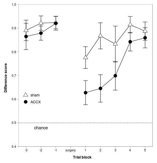
Data manipulation and graph:
phdfig28c_long = with(phdfig28c,
    rbind( data.frame( block=block, lesion="sham", diffscore=sham, sem=SEMsham ),
           data.frame( block=block, lesion="ACCX", diffscore=ACCX, sem=SEMACCX ) ) )

# Axis cutting not possible in ggplot2: http://groups.google.com/group/ggplot2/browse_thread/thread/7a6038fa9277b110
# So to replicate our previous example, the closest is probably:

f5 = ggplot(data = phdfig28c_long, aes(x = block, y = diffscore, group = lesion) ) +
     geom_errorbar(aes(ymin = diffscore - sem, ymax = diffscore + sem), width=0.3) +
     geom_line() +
     geom_point(aes(shape=lesion, fill=lesion), size=5) +
     scale_x_continuous("Trial block", expand=c(0,0), limits=c(-3.5,5.5), breaks=-3:5, labels=c("-3","-2","-1","surgery","1","2","3","4","5")) +
     scale_y_continuous("Difference score", expand=c(0,0), limits = c(0.4, 1), breaks=seq(0.4, 1, by = 0.1)) +
     scale_shape_manual(values=c(24,21)) + # as before
     scale_fill_manual(values=c("white","black")) +
     stat_abline(intercept=0.5, slope=0, linetype="dotted") +
     annotate("text", x=-2, y=0.48, label="chance") +
     theme_bw() + # make the theme black-and-white rather than grey (do this before font changes, or it overrides them)
     opts(plot.margin=unit(c(1,1,1.5,1.5), "lines"), # respectively: top, right, bottom, left; refers to margin *outside* labels; default is c(1,1,0.5,0.5)
          panel.margin=unit(0.25,"lines"), # default: what does it do?
          axis.ticks.margin=unit(0.25,"lines"), # default: gap between axis ticks and axis labels
          axis.title.x = theme_text(face="bold", size=12, vjust=-1), # use vjust to move text away from the axis
          axis.title.y = theme_text(face="bold", size=12, angle=90, vjust=0), # likewise
          panel.grid.major = theme_blank(),
          panel.grid.minor = theme_blank(),
          legend.position = c(0.2,0.4),
          legend.title = theme_blank(),
          legend.text = theme_text(size=12),
          legend.key.size = unit(1.5, "lines"),
          legend.key = theme_blank() # switch off the rectangle around symbols in the legend
     )
print(f5)
The ggplot2 library comes into its own. Data manipulation and graph:
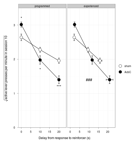
mdfig30_long = rbind( data.frame( type="programmed",  delay=mdfig30a$delay, lesion="sham", sqrtpresses = mdfig30a$sham, ysem = mdfig30a$SEMsham, xsem = 0 ),
                      data.frame( type="programmed",  delay=mdfig30a$delay, lesion="AcbC", sqrtpresses = mdfig30a$AcbC, ysem = mdfig30a$SEMAcbC, xsem = 0 ),
                      data.frame( type="experienced", delay=mdfig30b$shamdelay, lesion="sham", sqrtpresses = mdfig30b$shamresponses, ysem = mdfig30b$SEMshamresponses, xsem = mdfig30b$SEMshamdelay ),
                      data.frame( type="experienced", delay=mdfig30b$AcbCdelay, lesion="AcbC", sqrtpresses = mdfig30b$AcbCresponses, ysem = mdfig30b$SEMAcbCresponses, xsem = mdfig30b$SEMAcbCdelay ) )
          type     delay lesion sqrtpresses       ysem      xsem
1   programmed  0.000000   sham    2.640708 0.09574035 0.0000000
2   programmed 10.000000   sham    2.276907 0.07223806 0.0000000
3   programmed 20.000000   sham    1.956931 0.07676898 0.0000000
4   programmed  0.000000   AcbC    3.015727 0.07431359 0.0000000
5   programmed 10.000000   AcbC    1.977225 0.12287066 0.0000000
6   programmed 20.000000   AcbC    1.400463 0.11313513 0.0000000
7  experienced  2.127342   sham    2.640708 0.09574035 0.3954407
8  experienced  9.483373   sham    2.276907 0.07223806 0.4826215
9  experienced 15.812267   sham    1.956931 0.07676898 1.0514280
10 experienced  2.307076   AcbC    3.015727 0.07431359 0.3887686
11 experienced 11.680260   AcbC    1.977225 0.12287066 0.5989249
12 experienced 20.936766   AcbC    1.400463 0.11313513 1.8152600
mdfig30_annotations = data.frame(
    x = c(0,10,20,10),
    y = c(3.2,1.7,1.2,1.4),
    type = c("programmed", "programmed", "programmed", "experienced"),
    label = c("*", "*", "***", "###"),
    lesion = c("sham", "sham", "sham", "sham") ) # irrelevant but must not add new levels or they'll go into the legend

f6 = ggplot(data = mdfig30_long, aes(x = delay, y = sqrtpresses, fill = lesion) ) +
     facet_grid(. ~ type) +
     geom_line() +
     geom_errorbar(aes(ymin=sqrtpresses - ysem, ymax=sqrtpresses + ysem), width=0.8) +
     geom_errorbarh(aes(xmin=delay - xsem, xmax=delay + xsem), height=0.05) + # somewhat hard to get it to match other error bar size (different scale!)
     geom_point(shape=21, colour="black", size=5) +
     scale_fill_manual(values=c("white","black")) +
     scale_x_continuous("Delay from response to reinforcer (s)") +
     scale_y_continuous(expression(sqrt("active lever presses per minute in session 10")), expand=c(0,0), limits = c(0, 3.5), breaks=0:3) +
     geom_text(data = mdfig30_annotations, aes(x = x, y = y, label = label) ) +
     theme_bw() +
     opts(plot.margin=unit(c(1,1,1.5,2), "lines"),
          axis.title.x = theme_text(size=12, vjust=-1),
          axis.title.y = theme_text(size=12, angle=90, vjust=0), # likewise
          legend.title = theme_blank(),
          legend.key.size = unit(1.5, "lines"),
          legend.key = theme_blank()
     )
print(f6)
