|
R: basic graphs
|
Back to Local tips for R
http://www.psychol.cam.ac.uk/statistics/R/graphs1.html
|
R is a very powerful graphing package; for examples of what it can do, see the R Graph Gallery. What we'll be concerned about here is producing publication-quality simple graphs of the types frequently seen in the fields of experimental psychology and behavioural neuroscience, to get you going quickly. So to begin with, I'll replicate most of the major graph types I created with SigmaPlot for my PhD and MD theses.
Update 2011: these days it looks much easier to work with the ggplot2 library; see basic graphs 2.
These files are all comma-separated value (CSV) text files:
In all the code that follows, you'll have to change the path names to reflect where you actually put these files. Note also that the code is longer than it needs to be, because it is spaced and commented for clarity.
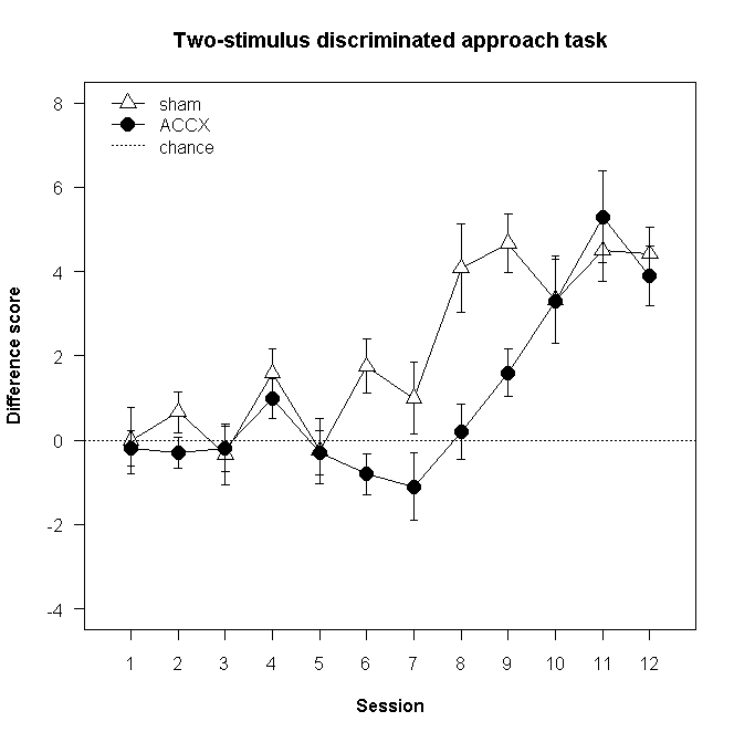
There are a number of ways to achieve this. We'll look at one here based on the plotCI function, part of the gplots package. You need to install the gplots packages from the R menus if you haven't done so before (Packages > Install Packages > choose a CRAN mirror > select "gplots"). You may also need to edit the code below so that the filename points to wherever you have stored the PhD_fig37B.csv file above. The code below imports the data, ensures the gplots library is available, and then uses a plotCI call to create the basic graph and the first line with its error bars, another plotCI call to add the second line and error bars, an abline call to add an absolute-referenced line, and a legend. The code is commented using # characters for explanation.
library(gplots) # for plotCI
fig37b <-read.table(
  "D:/Documents/Techniques/R/PhD_fig37B.csv",
  header=TRUE, sep=",", na.strings="NA", dec=".", strip.white=TRUE
)
attach(fig37b) # this is perhaps not the most elegant method: it puts the contents of "fig37b" on the search path

plotCI(
  x=session,
  y=sham,
  uiw=SEM_sham, # error bar length (default is to put this much above and below point)

  pch=24, # symbol (plotting character) type: see help(pch); 24 = filled triangle pointing up
  pt.bg="white", # fill colour for symbol
  cex=1.5, # symbol size multiplier
  lty=1, # line type: see help(par)
  type="o", # p=points, l=lines, b=both, o=overplotted points/lines, etc.; see help(plot.default)

  gap=0, # distance from symbol to error bar
  sfrac=0.005, # width of error bar as proportion of x plotting region (default 0.01)

  xlim=c(0.5,12.5), # x axis limits
  xaxp=c(1,12,11), # x-min tick mark, x-max tick mark, number of intervals between tick marks
  xlab="Session", # x axis label
  ylim=c(-4,8),
  yaxp=c(-4,8,6),
  ylab="Difference score",

  main="Two-stimulus discriminated approach task",
  las=1, # axis labels horizontal (default is 0 for always parallel to axis)
  font.lab=2 # 1 plain, 2 bold, 3 italic, 4 bold italic, 5 symbol
)
plotCI(
  x=session,
  y=ACCX,
  uiw=SEM_accx,

  pch=21, # symbol type 21 = filled circle
  pt.bg="black",
  cex=1.8,
  lty=1,
  type="o",

  gap=0,
  sfrac=0.005,

  add=TRUE # ADD this plot to the previous one
)
abline(h=0, lty=3) # horizontal line at y=0, linetype 3 = dotted
legend(
  x=0.5, # x coordinate of the top left of the legend
  y=8.5, # y coordinate of the top left of the legend
  box.lty=0, # line type to surround the legend box (0 for none)

  legend=c("sham","ACCX","chance"), # sequence of text for the legend
  pch=c(24,21,-1), # sequence of point types for the legend; -1 is a nonexistent point
  pt.bg=c("white","black",NULL), # sequence of fill colours for the points
  pt.cex=c(1.5,1.8,1),
  lty=c(1,1,3) # sequence of line types for the legend
)

detach(fig37b) # for good form, detach it again after use...
rm(fig37b) # ... and delete it.
That produces the following in the R graphics window:

One way to export the graph is to save it as a PDF, which also renders it rather more nicely.
dev.print(pdf, file="D:/Temp/RGraph.pdf", width=5.1, height=5.1, pointsize=8) # width/height are in inches
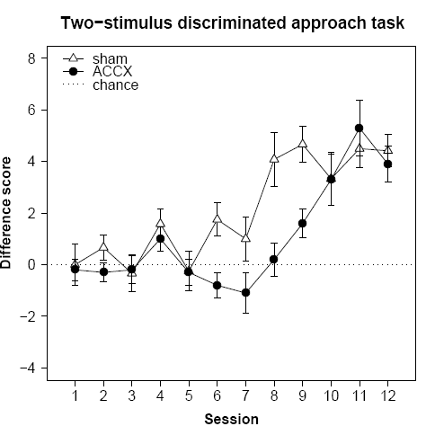
(If you make it too small, characters start falling off!) The PDF that's produced is here. A screenshot of the PDF is below; note the rather better rendering (although the hyphen has become an en dash; fine for minus signs, not so great for text).
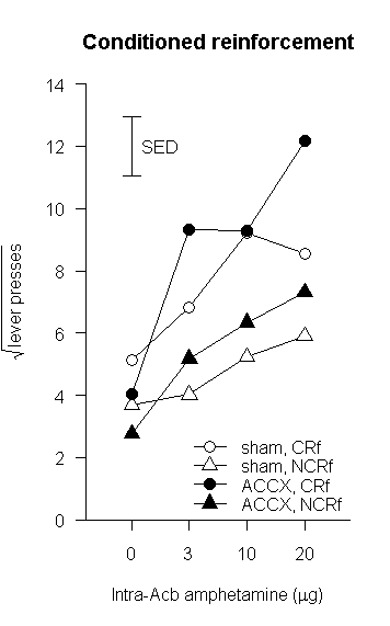
Here we introduce a few more fancy things, including expressions and Greek symbols in the axis labels, a categorical X axis, and a free-floating error bar.
fig21a <- read.table(
  "D:/Documents/Techniques/R/PhD_fig21A.csv",
  header=TRUE, sep=",", na.strings="NA", dec=".", strip.white=TRUE
)
attach(fig21a)
# now we define a new function for adding error bars:
superpose.eb <- function (x, y, ebl, ebu = ebl, length = 0.08, ...)
  arrows(x, y + ebu, x, y - ebl, angle = 90, code = 3,
  length = length, ...) # from http://users.fmg.uva.nl/rgrasman/rpages/2005/09/error-bars-in-plots.html

# in what follows, we force the four doses (0, 3, 10, 20) to be displayed as equally
# spaced categories (at absolute x positions 1,2,3,4), and then force the labels on
plot(
  x=1:4, y=shamCR,
  pch=21, bg="white", cex=1.5, type="o",
  ylim=c(0,14),
  yaxp=c(0,14,7),
  yaxs="i", # makes the axis just fit the range, rather than extending 4% beyond
  ylab=expression(sqrt("lever presses")),
  xlab=substitute(paste("Intra-Acb amphetamine (",mu,"g)")), # substitute() with an empty environment seems necessary
  axes=FALSE,
  main="Conditioned reinforcement",
  asp=0.5 # aspect ratio: here, one x unit is as long as 0.5 y units
)
axis(side=1, at=1:4, labels=dose) # turn on X axis
axis(side=2, las=1) # turn on Y axis (with text horizontal)
box(bty="L") # bty=box type to surround plot (e.g. "O", "L", "7", "C", "U" to set box shape or "n" for none)
lines( # use "lines" to add a line to an existing plot
  x=1:4, y=shamNCR,
  pch=24, bg="white", cex=1.5, type="o"
)
lines(x=1:4, y=ACCXCR, pch=21, bg="black", cex=1.5, type="o")
lines(x=1:4, y=ACCXNCR, pch=24, bg="black", cex=1.5, type="o")
superpose.eb(x=1,y=12,ebl=halfSED[1]) # superimpose +/- 0.5 SED, centred at (0,12); the value is in fig21a$halfSED[1]
text(x=1.5,y=12,labels="SED")
legend(
  x=2, y=3, box.lty=0,
  legend=c("sham, CRf","sham, NCRf","ACCX, CRf","ACCX, NCRf"),
  pch=c(21,24,21,24),
  pt.bg=c("white","white","black","black"),
  pt.cex=c(1.5,1.5,1.5,1.5),
  lty=c(1,1,1,1),
  y.intersp=0.9, # squish things up a bit vertically
  ncol=1 # one-column legend (=default)
)

detach(fig21a) # clean up
rm(fig21a)
After resizing the graphics window to make it a long and thin figure, that gives us the following:
Let's have a look at another one.
fig22d <-read.table(
  "D:/Documents/Techniques/R/PhD_fig22D.csv",
  header=TRUE, sep=",", na.strings="NA", dec=".", strip.white=TRUE
)
attach(fig22d)
superpose.eb <- function (x, y, ebl, ebu = ebl, length = 0.08, ...)
  arrows(x, y + ebu, x, y - ebl, angle = 90, code = 3,
  length = length, ...) # from http://users.fmg.uva.nl/rgrasman/rpages/2005/09/error-bars-in-plots.html

# our data begin as:
#    group CSpluslatency CSminuslatency CSplusSEM CSminusSEM
# 1  sham      3.884335       4.212531 0.2248404  0.2593122
# 2  ACCX      4.672486       3.619434 0.3476289  0.4902273
#
# step 1: reorganize

latencies = t(matrix( c(CSpluslatency, CSminuslatency), 2, 2)) # create a 2-by-2 matrix, then transpose it
colnames(latencies) = group
rownames(latencies) = c("CS+","CS-")
sems = t(matrix(c(CSplusSEM, CSminusSEM), 2, 2)) # do the same for the SEMs
colnames(sems) = group
rownames(sems) = c("CS+","CS-")

# latencies, for example, is now:
#         sham     ACCX
# CS+ 3.884335 4.672486
# CS- 4.212531 3.619434

fillcolours = c("gray","white")
x.abscis <- barplot(
  latencies, beside=TRUE,
  col=fillcolours,
  space=c(0.4,2), # spacing between bars in the same group, and then between groups
  ylim=c(0,5.5),
  ylab="Latency to approach (s)",
  main="Autoshaping approach latencies"
)
box(bty="L")
superpose.eb(x.abscis, latencies, ebl=0, ebu=sems) # +1 SEM, no descending error bar
# Note that the X coordinates were stored in x.abscis
legend(x=5, y=5.5, box.lty=0, legend=rownames(latencies), fill=fillcolours)

# Axis breaks, not reproduced here, are discussed at:
#   http://tolstoy.newcastle.edu.au/R/help/05/11/15877.html
#   https://stat.ethz.ch/pipermail/r-help/2005-May/072058.html
# Most use axis.break from the plotrix library for the break drawing itself.
# Others use gap.plot, gap.barplot, gap.boxplot from the same package.
# However, these options need a bit of careful massaging to get right. A simple example is shown below.

detach(fig22d) # clean up
rm(fig22d, latencies, sems, fillcolours, x.abscis)
That produces this:
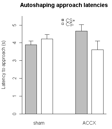
Here's the code:
fig23 <- read.table(
  "D:/Documents/Techniques/R/PhD_fig23.csv",
  header=TRUE, sep=",", na.strings="NA", dec=".", strip.white=TRUE
)
attach(fig23)
superpose.eb <- function (x, y, ebl, ebu = ebl, length = 0.08, ...)
  arrows(x, y + ebu, x, y - ebl, angle = 90, code = 3,
  length = length, ...) # from http://users.fmg.uva.nl/rgrasman/rpages/2005/09/error-bars-in-plots.html

approaches = t(matrix( c(CSplus, CSminus), 2, 2)) # create a 2-by-2 matrix, then transpose it
colnames(approaches) = group
rownames(approaches) = c("CS+","CS-")
sems = t(matrix(c(SEMCSplus, SEMCSminus), 2, 2)) # do the same for the SEMs
colnames(sems) = group
rownames(sems) = c("CS+","CS-")

fillcolours = c("gray","white")
x.abscis <- barplot(
  approaches, beside=TRUE,
  col=fillcolours,
  space=c(0.5,2), # spacing between bars in the same group, and then between groups
  width=1, # bar widths
  ylim=c(0,16),
  yaxp=c(0,16,8),
  ylab="Number of approaches",
  xlim=c(1.5,9.5), # makes sense in the context of width and space parameters
  xlab="Group",
  axis.lty=1, # enable tick marks on the X axis
  main="Autoshaping probe test",
  font.lab=2 # bold for axis labels
)
box(bty="L")
superpose.eb(x.abscis, approaches, ebl=0, ebu=sems) # +1 SEM, no descending error bar
legend(x=7, y=16, box.lty=0, legend=rownames(approaches), fill=fillcolours, y.intersp=1)
segments(x0=2.5, y0=15.5, x1=2.5, y1=16.0) # add three line segments to make a "comparator" line
segments(x0=2.5, y0=16.0, x1=4.0, y1=16.0)
segments(x0=4.0, y0=16.0, x1=4.0, y1=6.0)
text(x=3.25, y=15.5, labels="***", family="mono", font=1, ps=8) # add a "significance" label

detach(fig23) # clean up
rm(fig23, approaches, sems, fillcolours, x.abscis)
And here's the output:
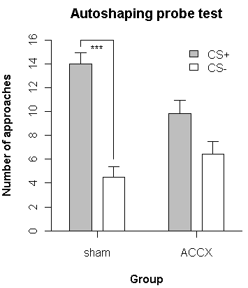
Axis breaks are a little tricky; see the links above for further discussion. This illustrates the simplest type of axis breaks, where there aren't really multiple simultaneous plotting scales.
library(gplots) # for plotCI
library(plotrix) # for axis.break
fig28c <- read.table(
  "D:/Documents/Techniques/R/PhD_fig28C.csv",
  header=TRUE, sep=",", na.strings="NA", dec=".", strip.white=TRUE
)
attach(fig28c) # this is perhaps not the most elegant method: it puts the contents of "fig37b" on the search path

gplots::plotCI(
  x=block, # note that since there's a plotrix::plotCI and a gplots::plotCI, we must be explicit
  y=sham,
  uiw=SEMsham,
  pch=24, # 24 = filled triangle pointing up
  pt.bg="white", # fill colour for symbol
  cex=1.5, # symbol size multiplier
  lty=1, # line type: see help(par)
  type="o", # p=points, l=lines, b=both, o=overplotted points/lines, etc.; see help(plot.default)
  gap=0, # distance from symbol to error bar
  sfrac=0.005, # width of error bar as proportion of x plotting region (default 0.01)
  xlim=c(-3.5,5.5), # x axis limits
  xaxp=c(-3,5,8), # x-min tick mark, x-max tick mark, number of intervals between tick marks
  xaxs="i", # makes the axis just fit the range, rather than extending 4% beyond
  xlab="Trial block", # x axis label
  ylim=c(0.4,1), # NOTE AXIS FROM 0.4 TO 1.0
  yaxp=c(0.4,1,6),
  yaxs="i", # makes the axis just fit the range, rather than extending 4% beyond
  axes=FALSE,
  ylab="Difference score",
  las=1, # axis labels horizontal (default is 0 for always parallel to axis)
  font.lab=2 # 1 plain, 2 bold, 3 italic, 4 bold italic, 5 symbol
)
box() # draw four sides to the plot area
axis(
  side=1, # X axis
  at=c(-3,-2,-1, 1,2,3,4,5),
  labels=c("-3","-2","-1", "1","2","3","4","5"),
)
axis(side=1,at=0,labels="surgery", tick=FALSE) # additional X axis label without a tick mark
axis(
  side=2, # Y axis
  las=1, # text horizontal
  at=c(0.4,0.5,0.6,0.7,0.8,0.9,1.0), # position of labels
  labels=c("0.0","0.5","0.6","0.7","0.8","0.9","1.0") # NOTE ACTUAL LABELS: THE "0.0" IS FALSELY POSITIONED
)
axis.break(axis=2,breakpos=0.45,style="slash") # break the left Y axis
axis.break(axis=4,breakpos=0.45,style="slash") # break the right Y axis
axis.break(axis=1,breakpos=0,style="slash") # break the bottom X axis
axis.break(axis=3,breakpos=0,style="slash") # break the top X axis
gplots::plotCI(
  x=block,
  y=ACCX,
  uiw=SEMACCX,
  pch=21, # symbol type 21 = filled circle
  pt.bg="black",
  cex=1.8,
  lty=1,
  type="o",
  gap=0,
  sfrac=0.005,
  add=TRUE # ADD this plot to the previous one
)
abline(h=0.5, lty=3)
legend(
  x=-3, # x coordinate of the top left of the legend
  y=0.65, # y coordinate of the top left of the legend
  box.lty=0, # line type to surround the legend box (0 for none)
  legend=c("sham","ACCX","chance performance"), # sequence of text for the legend
  pch=c(24,21,-1), # sequence of point types for the legend
  pt.bg=c("white","black",NULL), # sequence of fill colours for the points
  pt.cex=c(1.5,1.8,1),
  lty=c(1,1,3) # sequence of line types for the legend
)

detach(fig28c) # for good form, detach it again after use...
rm(fig28c) # ... and delete it.
Here's the output, via the PDF renderer as above:
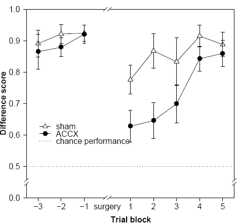
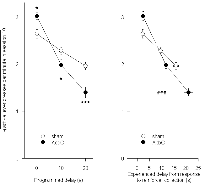
The code:
library(gplots) # for plotCI
# First, make a panel of plots. The par, layout, and split.screen commands are three ways to do this.
# We want a notional square to be divided so that the left half is figure 1, and the right half is figure 2.
# This means one row, two columns.
par(mfcol=c(1,2))

# Panel 1
mdfig30a <- read.table(
  "D:/Documents/Techniques/R/MD_fig30A.csv",
  header=TRUE, sep=",", na.strings="NA", dec=".", strip.white=TRUE
)
attach(mdfig30a) # this is perhaps not the most elegant method: it puts the contents of "fig37b" on the search path
par(mfg=c(1,1)) # select left-hand figure for drawing
plotCI(
  x=delay, # note that since there's a plotrix::plotCI and a gplots::plotCI, we must be explicit
  y=sham,
  uiw=SEMsham,
  pch=21, # 24 = filled circle
  pt.bg="white", # fill colour for symbol
  cex=1.8, # symbol size multiplier
  lty=1, # line type: see help(par)
  type="o", # p=points, l=lines, b=both, o=overplotted points/lines, etc.; see help(plot.default)
  gap=0, # distance from symbol to error bar
  sfrac=0.005, # width of error bar as proportion of x plotting region (default 0.01)
  xlim=c(-5,23), # x axis limits
  xaxp=c(0,20,2), # x-min tick mark, x-max tick mark, number of intervals between tick marks
  xaxs="i", # makes the axis just fit the range, rather than extending 4% beyond
  xlab="Programmed delay (s)", # x axis label
  ylim=c(0,3.3),
  yaxp=c(0,3,3),
  yaxs="i", # makes the axis just fit the range, rather than extending 4% beyond
  ylab=expression(sqrt("active lever presses per minute in session 10")),
  las=1, # axis labels horizontal (default is 0 for always parallel to axis)
  font.lab=1, # 1 plain, 2 bold, 3 italic, 4 bold italic, 5 symbol
  bty="L" # box type
)
plotCI(
  x=delay,
  y=AcbC,
  uiw=SEMAcbC,
  pch=21, # symbol type 21 = filled circle
  pt.bg="black",
  cex=1.8,
  lty=1,
  type="o",
  gap=0,
  sfrac=0.005,
  add=TRUE # ADD this plot to the previous one
)
legend(
  x=0, y=0.6, box.lty=0,
  legend=c("sham","AcbC"),
  pch=c(21,21),
  pt.bg=c("white","black"),
  pt.cex=c(1.8,1.8),
  lty=c(1,1)
)
text(x=0,y=3.2,labels="*", family="mono", font=2, ps=8)
text(x=10,y=1.7,labels="*", family="mono", font=2, ps=8)
text(x=20,y=1.2,labels="***", family="mono", font=2, ps=8)
detach(mdfig30a)
rm(mdfig30a)

# Panel 2
mdfig30b <- read.table(
  "D:/Documents/Techniques/R/MD_fig30B.csv",
  header=TRUE, sep=",", na.strings="NA", dec=".", strip.white=TRUE
)
attach(mdfig30b) # this is perhaps not the most elegant method: it puts the contents of "fig37b" on the search path
par(mfg=c(1,2)) # select right-hand figure for drawing
# first the AcbC data, with y-direction error bars
plotCI(
  x=AcbCdelay, # note that since there's a plotrix::plotCI and a gplots::plotCI, we must be explicit
  y=AcbCresponses,
  uiw=SEMshamresponses, # upper error bar (default is lower = upper)
  err="y", # Y-direction for error bars
  pch=21, pt.bg="black", cex=1.8, lty=1, type="o",
  gap=0, sfrac=0.005,
  xlim=c(-3,25), xaxp=c(0,25,5), xaxs="i", xlab="Experienced delay from response\nto reinforcer collection (s)",
  ylim=c(0,3.3), yaxp=c(0,3,3), yaxs="i", ylab="",
  las=1, font.lab=1, bty="L"
)
# add X-direction error bars for that plot...
plotCI(
  x=AcbCdelay, y=AcbCresponses, uiw=SEMAcbCdelay, err="x",
  pch=21, pt.bg="black", cex=1.8, lty=1, type="o",
  gap=0, sfrac=0.005,
  add=TRUE
)
# now the sham data
plotCI(
  x= shamdelay, y= shamresponses, uiw= SEMshamresponses, err="y",
  pch=21, pt.bg="white", cex=1.8, lty=1, type="o",
  gap=0, sfrac=0.005,
  add=TRUE
)
# add X-direction error bars for that plot...
plotCI(
  x=shamdelay, y=shamresponses, uiw=SEMshamdelay, err="x",
  pch=21, pt.bg="white", cex=1.8, lty=1, type="o",
  gap=0, sfrac=0.005,
  add=TRUE
)
legend(
  x=0, y=0.6, box.lty=0,
  legend=c("sham","AcbC"),
  pch=c(21,21),
  pt.bg=c("white","black"),
  pt.cex=c(1.8,1.8),
  lty=c(1,1)
)
text(x=10,y=1.4,labels="###", family="mono", font=2, ps=8)
detach(mdfig30b)
rm(mdfig30b)
The output:
